Tuesday 16 December 2008


Here is an image of two tigers playing in the water, i have found this image on the website deviant art, and then i have opened the image on photoshop and transformed the image there.
i have gone to
  • filter
  • filter gallery
  • then gone to artistic
  • and chose the effect to film grain
i have also disorted the water a bit by going to
  • filter
  • then liquify
This image is better becouse the strong colour of orange (the tiger itself) stands out, and is a smooth colour

Tuesday 9 December 2008

awareness magazine

I found an image of a tigers face really close up, and made the image larger by going to,
  • image,
  • image size,
  • and changing the width and height to the size of an A3 size paper.
I wanted the image of the tiger to look like it is almost disappearing, so i have erased parts of the tigers face, using the eraser tool, this part was a bit tricky doing becouse you had to be careful which parts of the tigers face you erased becouse you needed to leave most features so the animal is still recognizable. I havent erased the eyes becouse i belive these are the most stunning part of the tiger, or the marks above, i also havent erased the nose or part of the tigers mouth becouse if i had, the page would have looked plain, and i do not want that. I have also took the opacity down to 95, i havent took the opacity down far becouse i do not want to lose the strong colours the image has.

I then, using the text tool, typed Awareness, changed the font, the colour of the font, and the size, and placed it at the top of the picture over the image. Also i have typed other words like Disappearing? and placed it in the centre of the image, and tigers facing extinctions for more information, on the image. across the bottom of the page i have typed down the topics which will be in the magazine.

I have also copied a picture of a bar code from the internet, and added it to the image, with the date and the time above.

Here is the finishing image:

Tuesday 11 November 2008

Magazine front covers

These magazine covers have a good layout, and images that catch your eye


These three are the rolling stones magazine, the text in these are set down straight on the left hand side of the front cover. the first front cover, the text and the heading are over the image, while in the third front cover the heading is behind the image, while the text is in front. The images in these magazines are of famous music bands, artists. Also most of the writing is diffrent colours, for example the heading in the first magazine is a diffrent colour from the other two.


This is an entertainment magazine, the image on this magazine is advertising the movie twilight, the text is in front of the image, while the heading is behind the image. Also the text on the front cover of the magazine is set out on the left hand side of the magazine.

layout example


here is a layout example of a magazine.

On the front page of a magazine cover you will always have a:
  • Header
  • main image
  • main cover lines
  • date/price
  • barcode
  • cover lines

DVD covers


Here are two DVD covers that have been created by fans of the series/film, on Photoshop Cs2. These covers are very good, and realistic. The two DVD covers are, Girl Interrupted, which is a film iv have seen before, and the series Terminator the Sarah conner chronicles, which i also watch.

On The DVD cover of girl, interupted, it looks like, they have brightened the image of the eye, leaving the dark sections of the lashes, pupil and eyebrow. On the back of the case they have used 3 diffrent images from the movie and diffrent style of font, which suits the cover and the movie.

On the DVD cover the Terminator the Sarah Conner chronicles, it looks like they have used 2 diffrent images on the front cover and combined them, they have also done the same with the back cover, overlapping small images. The front cover is effective becouse they have used a white backround which makes the images stand out.

Tuesday 4 November 2008

nature backround images

I am creating a poster/ background for an awarness magazine.

I have firstly opened a picture of a flower i have took myself, and went to filter, blur then pressed gaussian blur, and then i have changed the pixels to 20, this has unfocused the image. Then i chose an abstract picture of some bamboo from the internet, to use as the texture in the image. I have copied the bamboo image into the blured image of the flower, and removed the colour from this image, then i blendid the bamboo image into the out of focused image of the flower, using the soft light option. Using the font tool i wrote a word to do with the theme nature, which was flower, many times, and rearanged the words in random places on the image, by using the free transform key, to create an effective and creative look. The name of the font i used is called Weltron Urban, and i used various sized fonts.


Here is the image of the purple flower i used.


Here is the abstract image of the bamboo, i used as a texture.

Here is the finishing image, i ended up with.

photo manupulation

Here are some photo manupulation images that caught my eye on the website deviant art-


this image of this eye was created by somone under the name
iris on the website deviant art, the name of the image is, nexthokage. the image started of as a black and white picture of an eye, then the image got moved to photoshop and then there it had some colour added to the pupil part of the eye by copying some colour then using the brush to carfully apply the colour to the pupil. This image is very effective and stunning.

the name of this image is, suicide_colours, this image got created by somone under the name emrekoyuncu on the website deviant art. This image got created on photoshop by using the wand tool by clicking on parts of the picture that you would like to leave the area in the colour red, and changing the rest of the picture into black and white. This picture caught my eye, becouse of the effect they used on the image.

This image is called desert reflection. The image was created by somone under the name yamibaku on the website deviant art. The major point of this photomanipulation was emphasizing the reflection in the sunglasses. He also said that he turned the image of his face black and white to hide the blemishis. This picture he created is very effective, and creative.

Sunday 2 November 2008

How my research will improve my magazine cover

I have learnt a lot about magazine layout, and how to use photoshop, this will help me improve my magazine cover alot, becouse i will use these skills to create my awareness magazine cover.

The tutorials i have done, i have learnt a lot from them, and they will help me a great deal to create my awareness magazine cover. I have learnt how to use photoshop for the first time, and how to use each tool correctly to get the best finish in each photo. I have learnt how to correct a photograph by removing scratches using the healing tool or the clone tool, and also to remove red eye, which is a comman problem with photographs, by using a series of tools including the gaussin blur tool, and paint brush.

I have also looked into the diffrent examples of digital art, created on photoshop, on the website deviant art. These have given me insperation and ideas, of what kind of image i would like to create for my awareness magazine i am doing. The Lord of the rings poster i have created, where i have used diffrent photographs of the movie and have arranged them to create a poster to advertise the movie, has also helped me becouse, i have learnt a lot and i will use most of these techniques to create my awareness magazine, for example over laping of layers and finishing texture in the background.

I have also come across many examples of magazine layouts that will help me, and give me an idea of what i want my magazine cover to look like. I now also now what is the sutable layout for a magazine.

Thursday 30 October 2008

Photoshop tutorial 2

image before
I used the rotate button to straiten the image. And then I used the crop tool to crop the image.
To bring out the contrast of the colours in this picture, I went to brightness and contrast and changed them.
In the middle of the picture there is an image of a boat in the water, to remove this we used the stamp clone tool, but because there are waves around the boat, we had to keep coping the ocean from all areas, so it doesn't look obvious that we have removed an object from there.

I then used the magic wand tool to select all areas of the sky, and then i brought the tolerance down to ten. I then opened up a new image of clouds, selected all the image and then copied the image. Then i went back to the boat image and clicked paste into, and the image of the clouds was in the area of the sky. I then moved about the image of the clouds to suit the foreground, then i changed the fill and opacity to make the image look better.

I then flattened the image, and the two layers of the image became one.
image after

Wednesday 29 October 2008

Combining Traditional and Digital

I am looking into how traditional photographs can be edited using photoshop or other digital technology. Here are some images that caught my eye on the website-http://www.deviantart.com/

Here are some Traditional art images, that caught my attention on this website.


This image was created by a person under the name Snow-Glass-Apples on the website deviant art. The image was created using watercolours, and then onto photoshop. The backround of this image is the watercolours blending in to one another, and in the foreground there is a close up shot of a woman's face.


This image was created by someone under the name
kell2860 on the website deviant art. This image was created by hand.

Here are some Digital art images , that caught my eye on this website.


This image was created by someone under the name ~aaliriyah on the website deviant art. The image is photomanupulation, and was created on Photoshop Cs2. The effect used on this image is a quick oil on water effect.


This image was created by someone under the name Sugargrl14 on the website deviant art. The image is very effected and was taken by a camera then coppied onto Photoshop, and then they turned the colour to black and white, leaving the colour of the eyes as they are. The colour of the eyes in this picture is stunning, and also the detail in this picture is good too.

Photoshop red eye tutorial

image before and after.

I uploaded the red eye photo onto Photoshop. I then zoomed into the eye area of the picture, and selected a grey area of the eye, using the eye drop tool. I then added a new layer, through clicking layer in the tool bar. The reason i added the new layer was, in case i made a mistake and damaged the original picture, but by adding the new layer we can delete it straight away if we made a mistake.

I then selected the paint brush, with a 2 pixel sized brush, and then painted over the red area of the eye, with the grey colour, that i copied with the eye drop tool. Then i went to the toolbar selected filter, then blur, then Gaussian blur at 1.0 pixels. By doing this, it has blurred the edge of the grey colour we have painted over the red area of the eyes, so it blends in.

Then i changed the layer blend to saturation, and after duplicated the layer, by going to layer, duplicate layer, and then changed the layer bland to hue. I then flattened the image so that the layers became 1.
This will not only help me with my work on the awareness magazine, but it will also help me with family pictures that have been damaged with red eye.

Thursday 23 October 2008

Research


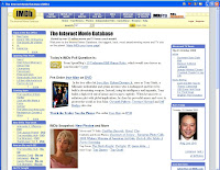
There are many ways in which media can be used and how media has changed over time. You Tube has really helped with the media industry, through showing trailers of movies online. I have easily gone on you tube typed in "movie trailers" and had a variety of choice on movie trailers; there is an example of a movie trailer above, of the movie twilight. The same can be done on websites such as imdb,(example on bottom of page) which is a website where you also can view trailers of movies, and on imdb you can also get extra information on the movie, like cast, ratings and peoples ratings from all over.


Tuesday 21 October 2008

backgroung picture's

Here are some abstract pictures based on the subject nature.

The pictures "before" have been taken with my digital camera, and then the "after" picture's have been manupulated on photoshop.


Picture before and after

With this picture i have brought up the brightness and contrast, then i have used the healing tool and the clone tool to get rid of any brown parts of the leave.


Image before Then after

In the first picture, i have brought the contrast and the brightness up. Then i have removed a brown coloured leaf from the picture, which was on the right hand side of the picture, with the clone tool by choosing a part of the picture to disguise the brown leaf.


image before image after

i have crooped this image so the top left hand corner finishes with the purple flower. Then i have used the clone tool and choosen a piece of the green plant to hide the buliding in the background.

Photoshop tutorial

Image before

first use the crop tool to trim away the black edging, on the image.


Then use the stamp tool at a 20 pixel brush size, to remove the scratch on the bottom left hand side of the image. To use the stamp clone tool, you put your mouse over a piece of the grey marble that is clean, press down the alt key intil a target sign appears instead of the mouse sign, and then click your mouse, and then click over the scratch and it should disappear.


After use the wand tool, and click the grey marble area. All the grey marble area should be included. Then go to Brightness and contrast, and put the brightness up and saturation down. This has changed the tone/brightness of the marble.


There is a bruise on the pear in the image. To remove this, you click on the healing tool, put over the blemish on the pear and click, and this should remove it.


Next we will create a clone of the green leaf on the grey marble. To do this we click on the stamp clone tool, click on a piece of the leaf, by pressing down the alt key and clicking then on the right side of the mouse. After you then apply a new clone of the leaf by the origianal, by clicking by the leaf and holding down the mouse and rubbing it intil a new leaf appears.
Image after

I have done this photoshop tutorial to improve my skills and to learn new skills on photoshop. This will help me improve my awareness magazine i am creating.

Tuesday 14 October 2008

image before

This is an image of my brother Daniel and our pet dog toby when they were younger. i chose this picture to use on photoshop becouse there eyes are a different colour to what they should be, for example my brothers eyes are red and my dogs eyes have gone bright yellow.

First I have removed the bright orange date of the picture that is on the right hand side of the page, by using the healing key. to use the healing key you press down alt and then click your mouse over a piece of the blue carpet on the image, then click over the date to get rid of it.

To remove the red eye, you zoom in on the eyes, then with the eye dropper tool you select the gray area of the eye, and then create a new layer, then with a 2 pixel paint brush, colour over the redarea. After go to the toolbar at the top of your sgrin then go down to filter across to blur, then go across again to gausslan Blur. Put the gausslin blur at 1.0 pixel. Then you change the layer to saturation, then duplicate it. Then change new layer to hul, then flatten the image.

To remove the bright yellow eyes on the dog i had to find a sutible image of another dog, and then zoom in on the eyes, and with the eye dropper tool i selected an area of the eye. After i went back to the origanal image then i added a new layer, then i carefully, with a 2 pixel paint brush, coloured the dogs eyes, and then went to gausslan blur, and selected a sutible pixel. After i then i flattend all of the layers.

image after

I couldnt get the eyes on the dog right, becouse i found it very difficult to find the right colour that would look right. Next time i would probably bring in another picture of the dog showing the right eye colour, so i could copy that eye colour instead of looking on the web, for something totally diffrent.


Digital technology

there are many varitys of digital technology in media, one for example is
I-player- i-player allows you to watch programmes you have missed from channels like BBC 1, BBC 2, BBC 3, BBC 4, and more, so if you have missed a programme of a series, you can log on I-player and watch it from your computer sgrin.

Picture of the website i-player.

Digital Technology has improved, becouse now you can watch TV programmes online, and you can access the internet anywhere, for example, mobile phones, i-pods.

photoshop

Here is a photo of me and my family when we were younger, on the beach. The photo is to dark, and you can hardly make out what the image is.

On photoshop i have gone on the wand key and clicked the bottom section of the picture which is the darkest are of the photo (and not the sky) and then gone on brightness and contrast, and brought them up. Then i've used the healing tool to get rid of an marks that were on the photo.


Photo before and after

This image didnt turn out to what i planned, so probably next time i will not use the wand tool, but brighteen the whole image as one.

Tuesday 7 October 2008

definestions

PSD- photoshop document- image file created in adobe Photoshop, high quality images
TIF- Tagged image file- an industrial standard image, opens on all computers
JPEG/JPG- Joint photographic experts group- compression/decompression of an image, loses quality
GIF- Graphics interchange format- compress data, great for anything with few colours, maxemine colours-256
PICT- another image apple format, good for previews
bitmap - have fixed resolution so they can be resized, they are made of small dots or pixels
DPI- dots per inch- the move dots per inch, the higher the resolution
vector graphic- a graphic image drawn by shapes and lines