Wednesday 17 June 2009
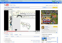
Flash animation on you tube
This Flash animation, i enjoyed watching and thought it was very cleaver idea and also cleaver on how it was created. The animation has the Flash programme in it, and it shows someone drawing a stickfigure on flash, then the stick figure coming alive and creating havoc and destroying Flash programme.
Here are some shots taken from this small animation :
Flash animation - Burnt Face Man
Burnt Face Man
Here are some screen grabs of the animation burnt face man. I thought this would be a good example of flash animation becouse it is the sort of design i would like to use in my flash animation.
The only movement that is in this part of the animation is the white lines in the background, which indicates that he is flying.
In this part of the animation they have walked two charecters into the screen.
In this clip they have actually used a photo of some womans face in this.
Lord of the Rings Poster
I was learning how to use Photoshop CS2, so as a class we decided to base it on a Lord of the Rings and create a poster.
With 3 differnt images from the movie, i added them onto 3 diffrent layers. I then individually selected each image and using the Eraser Brush with a featherd edge, i removed the edges of the images so i was just left with the charectors.
I then used a textured leather image and pasted this onto it's own layer at the top of the layers pallet, I then sharpened the image twice so the texture was more noticable. We then flattened the image and added
Image
Adjustments
Colour Balance
this gave the slightly yellow colour that linked in with logo.We copied the image and pasted it onto another layer and used the layer blend "Overlay" to heighten the contrast and mood of the colours.We finally added the logo and used the layer blend "Lighten" to erase the black back ground.
This is my finished image of Lord of the Rings.
Tuesday 2 June 2009
Flash movie characters
Here is th sketch i have scanned for my animation :
This is the image i have drawn in my sketch pad
This is the image i have drew on Flash, by going over the image i had drawn by hand.
This is my main charector i have drawn for my misheard lyrics piece. The charector is Lady Gaga who is a singer. The reason i have chosen her to be my main charector is, becouse she is the artist who created and sang the song, i have chosen to be my misheard lyrics piece.
Tuesday 17 March 2009
Storyboard
Here is a link to this website-
http://accad.osu.edu/womenandtech/Storyboard%20Resource/
It explains the varity of shots, you can draw to see what would look better on film/ animation. And it also has diffrent examples of storyboard, for exaple it shows a storyboard which is just images and it concentrates more on the design and quality of the images, and another which is text and images, which has more information on the piece.
Here is some intresting info from the site:
CLOSE-UP SHOT: A close range of distance between the camera and the subject.
DISSOVLE: A transition between two shots, where one shot fades away and simultaneously another shot fades in.
FADE - A transition from a shot to black where the image gradually becomes darker is a Fade Out; or from black where the image gradually becomes brighter is a Fade In.
HIGH CAMERA ANGLE: A camera angle which looks down on its subject making it look small, weak or unimportant.
JUMP CUT: A rapid, jerky transition from one frame to the next, either disrupting the flow of time or movement within a scene or making an abrupt transition from one scene to another.
LEVEL CAMERA ANGLE: A camera angle which is even with the subject; it may be used as a neutral shot.
LONG SHOT: A long range of distance between the camera and the subject, often providing a broader range of the setting.
LOW CAMERA ANGLE: A camera angle which looks up at its subject; it makes the subject seem important and powerful.
PAN: A steady, sweeping movement from one point in a scene to another.
POV (point of view shot): A shot which is understood to be seen from the point of view of a character within the scene.
REACTION SHOT- 1.: A shot of someone looking off screen. 2.: A reaction shot can also be a shot of someone in a conversation where they are not given a line of dialogue but are just listening to the other person speak.
TILT: Using a camera on a tripod, the camera moves up or down to follow the action.
ZOOM: Use of the camera lens to move closely towards the subject.
Tuesday 10 March 2009
Animation
www.questfortherest.com
This an animated game, were you have to help find the charectors way back to their home place. They play music in the background of this game, which the person who has created this game has also created the music you listen too, along with the game. This is a good way to advertise their own music, becouse while you are playing the game you don't relise what you are listing too but you think it goes very well with the game and its a good song.
The animation in this was good and effective, the small people were simple and cute, and the background of this animation was done well, there were small movements that made it look like it wasnt just an image, for example the branches of the plants by the lake, like they were getting blown by the wind.
Tuesday 3 March 2009
Misheard lyrics research
The best-misheard lyrics I have found on you tube are:
Misheard Lyrics - Sean Paul - Temperature - I enjoyed the misheard lyrics on this and found it very funny and entertaining, even though the images were not done well, you could still understand them.
How to save a life: The misheard lyrics - I enjoyed this, I found the misheard lyrics sounded very good, and the images they used in this went along with the song very well.
Face Down Misheard Lyrics - Red Jumpsuit Apparatus - The misheard lyrics in this was very good, and I found it was very entertaining, still could have done better with the images, but it still made sense.
I would recommend anyone to watch these on you tube, because I found them entertaining, and a great help and Inspiration for me, for my misheard lyric piece.
I have an idea of what there needs to be to create a misheard lyrics piece along with an animation, by viewing others that people have created before us in last years class, and I must admit that they weren’t all that entertaining or good, apart from one, whose animation was amazing, and very detailed in my opinion.
From viewing these, I now have an idea of what I need to do, to create a good decent entertaining misheard lyrics piece. First of, the song needs to be inline with the animation, otherwise the viewer will get confused, and it will not work, because it will not make any sense at all. I also need to make the lyrics understandable by either making an image that goes with the words and in line with them; if this does not work then the best thing is to use text underneath.
My Plan for my misheard lyrics animation piece is to create an animation that goes with the lyrics. I am also going to try and make my animation funny and entertaining. I am not going to make it too difficult to create, but I am going to make my animation look decent, and not something I have just quickly scribbled on screen. I will also chose a song a now well, and that is a good misheard lyrics song.